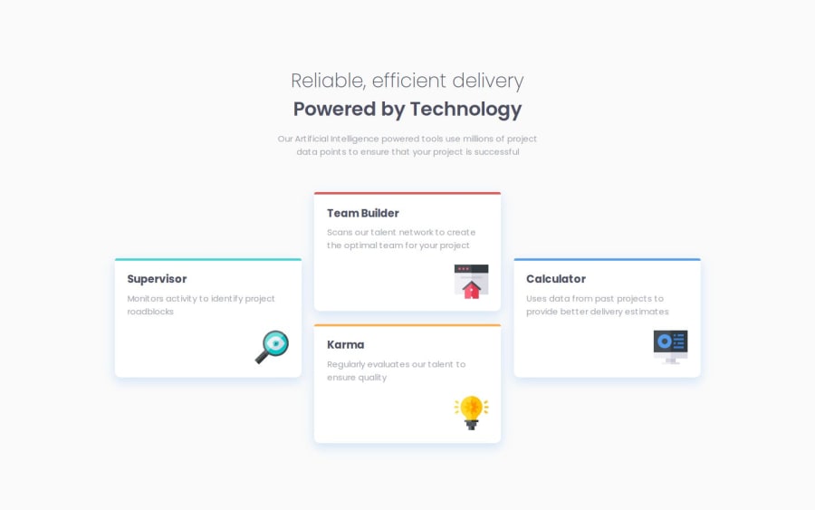


Design comparison

Solution retrospective
I'm proud that I got through it, honestly. It seemed simple enough at first but by taking a mobile-first approach and knocking out what felt like a simple layout, the desktop layout absolutely threw me for a loop. I kind of wish I had started from the desktop layout and then reduced to mobile as a single column was easy enough but the varying positions of the cards in the desktop layout was a lot harder to tackle than I thought it would be.
What challenges did you encounter, and how did you overcome them?Getting the left and right cards on the desktop to align to the vertical center of the container. At first, I tried using flex and separating everything into its own column but that messed with the mobile layout and felt clumsy overall. I ended up changing the layout from flex-based to grid-based on desktop. I don't have a ton of experience using Grid so I had to do some research on MDN to see how I could use Grid attributes to achieve the desktop design and it took a while.
What specific areas of your project would you like help with?Is there a more efficient, less complicated approach to this? Is mixing Grid and Flex okay as long as it achieves the solution or should I have stuck to one or the other and worked my way through it? This project was frustrating and I'm not sure if I just made it more complicated than it had to be and that's why I struggled with it so much.
Community feedback
Please log in to post a comment
Log in with GitHub
Join our Discord community
Join thousands of Frontend Mentor community members taking the challenges, sharing resources, helping each other, and chatting about all things front-end!
Join our Discord