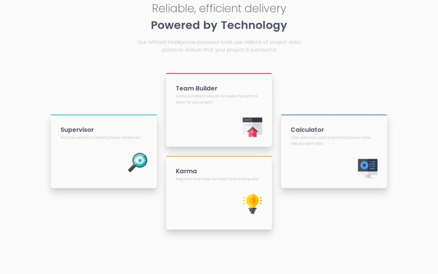
Design comparison
SolutionDesign
Solution retrospective
What are you most proud of, and what would you do differently next time?
- Project time has drastically reduced compared to my first project on font-endmentor.
-I faced difficulty in arranging the desktop version grid.
- Overcame the challenge by using ration(fr) grid instead of using px from Figma file.
- How can I better structure my code and do it in less steps?
Community feedback
Please log in to post a comment
Log in with GitHubJoin our Discord community
Join thousands of Frontend Mentor community members taking the challenges, sharing resources, helping each other, and chatting about all things front-end!
Join our Discord
