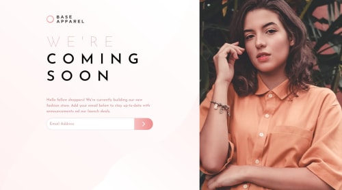
Submitted over 3 years agoA solution to the Base Apparel coming soon page challenge
Fashion Store
bootstrap
@Edinson25

Solution retrospective
In this project I continue practicing bootstrap, I would like to know if someone can solve a doubt, I managed to make it look good on smartphones, but I feel that on a tablet the image would look somewhat stretched and the definition of the image is damaged
Code
Loading...
Please log in to post a comment
Log in with GitHubCommunity feedback
No feedback yet. Be the first to give feedback on Edinson Morales's solution.
Join our Discord community
Join thousands of Frontend Mentor community members taking the challenges, sharing resources, helping each other, and chatting about all things front-end!
Join our Discord