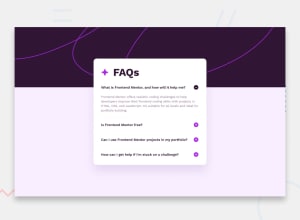
Design comparison
Solution retrospective
Proud of the fact that i could complete this project with my Knowledge, and look forward to doing other project
What challenges did you encounter, and how did you overcome them?I add a bit of challenge with the JavaScript, but was able to over come it by doing a bit of online search
What specific areas of your project would you like help with?Nill
Community feedback
- @JoshuaAsistioPosted 7 months ago
I like your solution and the transition that ou added to the answers. I would recommend that you add a functionality that would close all the other annswers when the user clicks on a different one. That way, the content element containing all the content wouldn't grow so big that the vertical space around it almost disappears. Also, I recommend adding a bit more line-height to the answers so that they don't look too clumped up.
Marked as helpful0
Please log in to post a comment
Log in with GitHubJoin our Discord community
Join thousands of Frontend Mentor community members taking the challenges, sharing resources, helping each other, and chatting about all things front-end!
Join our Discord
