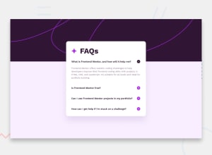
Design comparison
Solution retrospective
I am proud of because I feel comfortable when working with javascript to manipulate the DOM object to change icons, display answer of the faq questions
What challenges did you encounter, and how did you overcome them?My challenges
-
I could toggle the plus icon to minus but the background color of the plus was not black as the design goal is. I solved it by changing the path of image in javascript to absolute. However, I still don't understand why but the scenario after that was good.
-
My second challenge was the height of the card was being overflowed by the content after toggle the question. It came outside the card. Therefore, I did search stackoverflow and the solution is to set the height to "auto". Pretty simple!
Community feedback
- @ZOROexePosted 10 months ago
Hey, Congratulations on completing the challenge .
The solution looks great :)
One thing you can apply is adding transition property to the 'answer-hidden' class so that when you toggle the button it provides a better visual experience. You can implement this by adding a max-height property to 'answer-hidden' and 'answer-display' classes and then assigning max-height to 0 in 'answer-hidden' and any height value to 'answer-display'. Then adding transition property for max-height in <p> elements. You can then remove the display properties in these classes.
Hope you find this helpful.
Keep up the fantastic work and good luck in your front-end journey.
0
Please log in to post a comment
Log in with GitHubJoin our Discord community
Join thousands of Frontend Mentor community members taking the challenges, sharing resources, helping each other, and chatting about all things front-end!
Join our Discord
