Design comparison
Solution retrospective
I'm quite happy with the Javascript, I found it quite tricky but played around with the opacity and width to create the effects.
What challenges did you encounter, and how did you overcome them?Firstly, the JS was challenging, changing in the image from positive to negative in the if statements then changing the width and removing the opacity.
I felt very proud when I finished it.
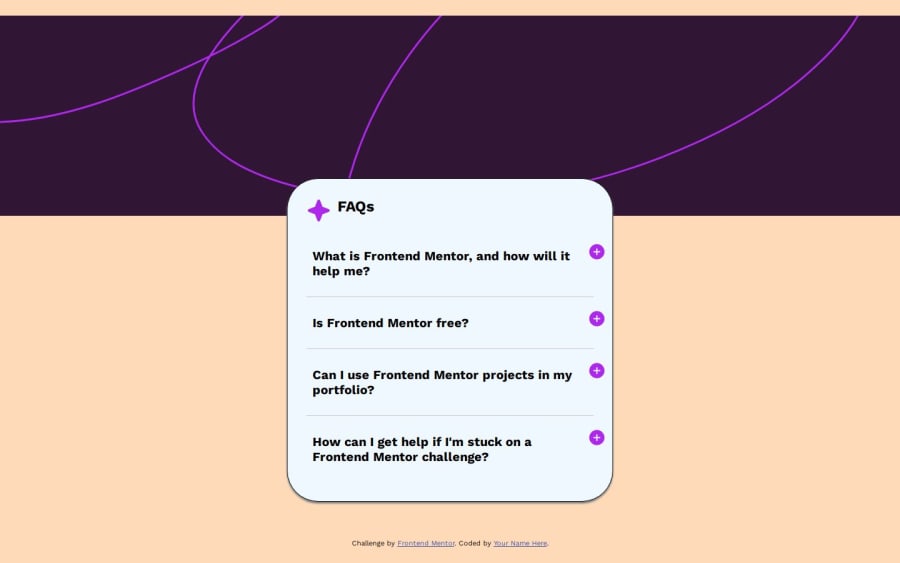
2nd challenge was to center the main container, I only managed to do it with the media query. My main issue is with the background, it doesn't go all the way to the top of the screen and on mobile devices it moves further down, not sure why or how to fix it,
What specific areas of your project would you like help with?Can I have a detailed explanation of how to make the background go all the way to the top of the screen, I've tried 0 padding, 0 margin, why does it move when you click on the plus signs and what code could I use to stop that from happening?
Please log in to post a comment
Log in with GitHubCommunity feedback
No feedback yet. Be the first to give feedback on AlexStraton's solution.
Join our Discord community
Join thousands of Frontend Mentor community members taking the challenges, sharing resources, helping each other, and chatting about all things front-end!
Join our Discord
