
Design comparison

Solution retrospective
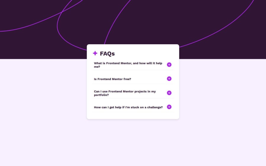
I'm most proud of how I was able to implement the interactive toggling feature for the FAQ answers. The dynamic show/hide functionality works well, and it’s fully accessible with keyboard navigation, which was one of my goals. Additionally, I’m happy with how I implemented a mobile-first design approach, ensuring the layout looks good on both small and large screens.
Next time, I would focus more on refining the accessibility aspects, especially by adding ARIA attributes to improve screen reader support. I would also consider adding animations or transitions to make the interactions smoother and more visually engaging.
What specific areas of your project would you like help with?One of the challenges I faced was figuring out how to manage the toggling of answers. Initially, I had trouble making sure that only one answer was displayed at a time, as clicking on a question would sometimes cause multiple answers to display simultaneously. I overcame this by clearing all answers before showing the clicked one. This involved selecting all the answer elements and resetting their display property before toggling the one that was clicked.
Another challenge was ensuring that the layout was responsive. I spent extra time tweaking the styles for mobile devices and making sure the design was clean and easy to navigate. Flexbox and media queries were really helpful in addressing this.
Community feedback
- @MarziaJaliliPosted 2 months ago
Hi there!
The project works as expected. It looks great.
Some sort of suggestion:
- Frist, you use the
gridto center the card instead of positiong it:
body {
  display: grid;
  place-items: center;
  min-height: 100vh;
}
This ensures that the card will be centered even if the answer expands.
- Second, instead of just using an <div> for the toggle buttons, use the
<button>element an then wrapp the image inside. This gives more information to the screen readers and specifies it's a button rather than an actual image.
<!--current code => -->
<div class="icon">
  <img src="./assets/images/icon-plus.svg" alt="icon-plus">
</div>

<!--change it too => -->
<button class="icon">
  <img src="./assets/images/icon-plus.svg" alt="icon-plus">
</button>
The
<button>element comes with some default styles. So, get rid of them using the code below:button { border: none; background-color: transparant; }This will improve the project even further😎
0@PichikachanduPosted about 2 months ago@MarziaJalili okay Thanks for your valuable feedback
0@PichikachanduPosted about 2 months ago@MarziaJalili okay Thanks for your valuable feedback
0@MarziaJaliliPosted about 2 months ago@Pichikachandu man!
I just forgot to change the code for the button, let me fix it now!!!
0 - Frist, you use the

Please log in to post a comment
Log in with GitHubJoin our Discord community
Join thousands of Frontend Mentor community members taking the challenges, sharing resources, helping each other, and chatting about all things front-end!
Join our Discord