Design comparison
SolutionDesign
Solution retrospective
What are you most proud of, and what would you do differently next time?
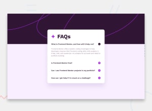
I used the NextUI accordion component. Their library is based on TailwindCSS so I loved it immediately
What challenges did you encounter, and how did you overcome them?The trickiest part was to go through the customisation of the NextUI component but I managed by going through their docs
What specific areas of your project would you like help with?The background image looks good on the two screen sizes set for the challenge, but I'd love to improve it on a medium screen. Any ideas?
Community feedback
Please log in to post a comment
Log in with GitHubJoin our Discord community
Join thousands of Frontend Mentor community members taking the challenges, sharing resources, helping each other, and chatting about all things front-end!
Join our Discord
