

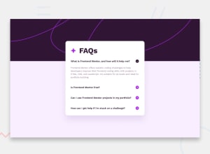
Design comparison

Solution retrospective
Sometimes when i deploy a website on github pages the images don't load even if the path is correct. How can i fix it? (same case with font).
-
Is there something i can improve? (code structure, bad practices, etc).
-
Any tip for breakpoints and media queries?
Community feedback
- @l3lazePosted over 1 year ago
Along with some of the relative paths needing a fix, there's a typo in the favicon which will cause it to fail to load. -
<img src="assets//images/icon-star.svg" alt="star icon" />- two/in a row in the path, which will be interpreted as "assets/". The dev console (Ctrl/Cmd + Shift + i or F12) should mention this if you load the page in it.I don't know if any self-closing elements still require the trailing
/>nowadays, and I don't know if they ever were required on some of these elements. Self-closing are when the tag and all it's data are contained entirely between the opening and closing brackets<...>.The CSS and JS file are fine in the root folder alongside the HTML file in small projects. If you're more comfortable having them split off though, that won't hurt anybody.
An
h1tag is required for accessibility purposes. If you scroll to the bottom of your solution on FM it should have an element showing an accessibility report that mentions this. There's also a HTML report if you hit the button to switch between the two tabs.While div does work great in so many situations, HTML is more readable in general for developers with more use of semantic markup. Like heading, paragraph, button, etc, along with class names which can help identify the content and the containing element at once.
Media queries only apply when the rule is met, so currently it's only effective on screens that are 320-800px wide (>= 320 and <= 800). Since the media query seems to be mobile-only it would be best to make it only run on either 799 or 800px or less, like
@media screen and (width < 800px)for 799, or<= 800for 800. This way it will still take effect on screens less than 320px wide, which must be tiny older smartphones and flip phones because it's pretty small.That JS is beautiful; nice work! Minimal code to accomplish the goal and very easily understandable. Could use some whitespace for formatting between const declaration and loop and then between the two functions, but that's a nitpick (doesn't really matter, more personal preference than industry standards).
A lint tool should be able to automate checking for many of the above issues. In an IDE it may be built-in to the app, or available as an extension, and there are of course a ton of tools for this which run in NodeJS and many other languages. I'm using VSCode and the HTML linter seems to be included, but not CSS or JS. CSS I'm trying Stylelint currently, but I'd be just as willing to try the other popular options. For JS I have used StandardJS for years now, but ESLint is another great option - so much so that Standard uses it behind the scenes, lol.
Marked as helpful0@JEWebDevPosted over 1 year ago@l3laze Thank you very much for your detailed answer. I will make the corrections to the html and media queries. Thanks for giving it a look to all of it. It is my first time working with media queries, the previous challenge I made had the same design for mobile and desktop so it wasn't necessary.
1@l3lazePosted over 1 year ago@LaxusWebDev Very welcome :) Yeah, life without any need for media queries is definitely easier, lol. Once you get used to them they are really nice, and that'll happen the more you use them & play with the values. Speaking of, playing with the browser dev tools (F12 or Ctrl/CMD + Shift + i) may help, as then you can find the exact pixel size it collapses or expands at. If it's just the logic part, that also comes with time; little things click here and there, and then a wave of realization may feel like you just levelled up.
0 - P@midnjerryPosted over 1 year ago
I love how you made the background purple so on wider screens you still have the background extended. However, I would have liked to see the background image loaded on the left , otherwise you see an abrupt start of the pink line. Good job!
0@JEWebDevPosted over 1 year ago@midnjerry You're right! I will make that change, thank you!
1 - @LudzikkPosted over 1 year ago
Hello
background-image: url("assets/images/background-pattern-desktop.svg");since this code is in css/style.css by doing path like u did, u are kinda like stuck inside of css folder, you first need to use ../ to leave css folder and enter your main folder and then continue path that you did.
background-image: url("../assets/images/background-pattern-desktop.svg");You did same path in js but it's working there becouse js is putting this path to html file. Your html file is in main folder so that's why it don't work only in css file.
0@JEWebDevPosted over 1 year ago@Ludzikk Hello! Thank you for your answer, it was very clear and helped me to understand the issue. I will have it in mind on future solutions. Have a nice day.
0


Please log in to post a comment
Log in with GitHub
Join our Discord community
Join thousands of Frontend Mentor community members taking the challenges, sharing resources, helping each other, and chatting about all things front-end!
Join our Discord