Design comparison
Solution retrospective
Any feedback is greatly appreciated!
Community feedback
- @R3ygoskiPosted 7 months ago
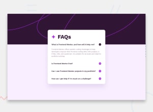
Hello Josh, congratulations, your project is looking really good, and that animation you added makes it even better.
I'd like to give you a tip regarding the card. If you want it to resemble the design a bit more closely, consider using this property in your
.wrapper:padding: 3.5rem 2.5rem;. This will create a slightly larger spacing at the top and bottom, making it more similar to the design.Your JavaScript is also well done.
Again, congratulations on your project, it's very well done, both in terms of logic and overall structure. If you have any questions, feel free to comment below, and I'll try to help you in the best way possible.
Marked as helpful0
Please log in to post a comment
Log in with GitHubJoin our Discord community
Join thousands of Frontend Mentor community members taking the challenges, sharing resources, helping each other, and chatting about all things front-end!
Join our Discord
