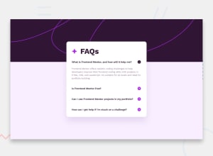
Design comparison
Solution retrospective
Proud of being able to apply JavaScript to the page to make it more interactive.
What challenges did you encounter, and how did you overcome them?The content in my container was spilling outside of it when showing 2 or more answers to the questions. so I added a scrollbar to prevent it.
What specific areas of your project would you like help with?I'm still struggling with responsiveness and making it responsive for certain screen widths. Also when clicking the plus button to show an answer its position slightly changed, not too sure how to correct that.
Community feedback
- @SvitlanaSuslenkovaPosted 2 months ago
body { display: flex; flex-direction: column; justify-content: center; align-items: center; min-height: 100vh; } Try this to align(top-bottom) and justify(left-right) your project to the center. It applies to the parent component(body). You can use grid instead of flex too(with some changes).
Marked as helpful1
Please log in to post a comment
Log in with GitHubJoin our Discord community
Join thousands of Frontend Mentor community members taking the challenges, sharing resources, helping each other, and chatting about all things front-end!
Join our Discord
