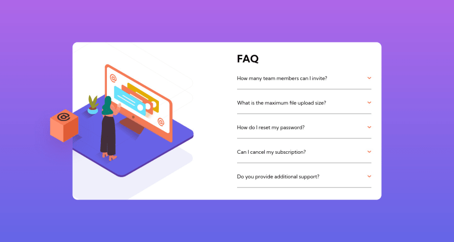
Design comparison
Solution retrospective
This project was definitely a challenge for me, as I had to learn a lot of new things along the way. Specifically, I had to dive into transitions, animation, and positioning, which were all pretty complex concepts. Despite the difficulty, I was really excited to work on this project because it was my first time tackling something like this. I knew I was going to face some hurdles.
As I started working on the project, I quickly realised that my code was getting pretty messy. Since I was new to this, I wasn't exactly sure how to structure everything properly. I tried my best to keep things organised, but ultimately, it was a bit of a mess. Additionally, I missed a small hero picture while working on the mobile version of the project.
As I started working on the project, I quickly realised that my code was getting pretty messy. Since I was new to this, I wasn't exactly sure how to structure everything properly. I tried my best to keep things organised, but ultimately, it was a bit of a mess. Additionally, I missed a small hero picture while working on the mobile version of the project.
Please log in to post a comment
Log in with GitHubCommunity feedback
No feedback yet. Be the first to give feedback on iamis15's solution.
Join our Discord community
Join thousands of Frontend Mentor community members taking the challenges, sharing resources, helping each other, and chatting about all things front-end!
Join our Discord
