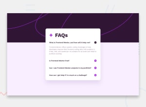
Design comparison
SolutionDesign
Solution retrospective
This was a great project for practicing hiding things on the page. I learned how to use max-height to animate as well as checking for margins or padding when using it so that it won't take up any space on the page, similar to display: none. Any tips for improvement would be appreciated. Thanks!
Michael
Community feedback
- @danielmrz-devPosted 11 months ago
Hello Michael!
Your project looks really good!
I just have one suggestion:
- You don't need a separate container to create that background pattern. You can use both
background-colorandbackground-imagetogether on the body. They will not cancel each other.
I hope it helps!
Other than that, great job!
0 - You don't need a separate container to create that background pattern. You can use both
Please log in to post a comment
Log in with GitHubJoin our Discord community
Join thousands of Frontend Mentor community members taking the challenges, sharing resources, helping each other, and chatting about all things front-end!
Join our Discord
