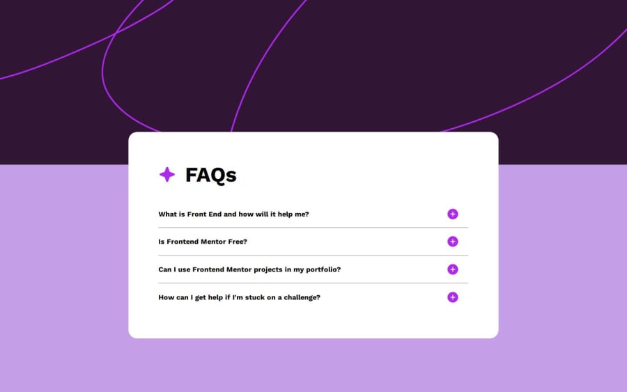
Design comparison
Solution retrospective
I am most proud that I was able to install all of the functionality that I wanted to add to this project including adding functionality to both the enter button and spacebar.
The thing that I would do differently is that I would make sure to add a keyindex attribute at the beginning of the coding process to make sure that the app is accessible to everyone.
What challenges did you encounter, and how did you overcome them?I encountered quite a bit of difficulty getting responsiveness from the buttons. The way that I solved it was trying to get a response of any kind from the app, and then worked to get it closer and closer to my desired action.
I also struggled to add keyboard functionality to the app as I had never done that in a project before. That challenge was overcome by doing a lot of research and trial and error.
What specific areas of your project would you like help with?I was not able to get the min-height and max-height properties of the page to work properly. I wanted the page to expand if the user opened all of paragraphs at once, but I was not able to do this, so I just created a single set size that would work decently no matter what the FAQ height is.
Is there a way that I could get the page size to expand with the div of the FAQ? How would I do this?
Community feedback
- @ortalyartsPosted about 1 year ago
Hey @Cryptoguy5,
Congrats on completing the challenge!
I have a few suggestions:
- I think you just don't need to specify the height for your accordion container (div.faq). If you remove
min-height: 65%;(line 50) it should work just fine and adjust the height automatically according to the content. - Also for your accordion container (div.faq), it might be better to set the max-width to match the design file (i.e.
max-width: 37.5rem;). This way it will not be too stretched on wide screens. - Set
cursor: pointerfor the div.question, so the user knows it is clickable. - Remove
position: absolutefrom the image.plus, because it causes overlapping of text and image in narrow screens. Instead, to better arrange the div.question, try to usejustify-content: space-between. This should place the h4 & the img as in the design file. - Alternatively to nr.4 (if you do need position: absolute) try adding padding-right to the div.question, so that the h4 wouldn't reach the img.
I hope you find this helpful :) Cheers!
Marked as helpful1@Cryptoguy5Posted about 1 year ago@ortalyarts, thank you for your suggestions. I have implemented them, and it has improved the functionality and design of the project.
1 - I think you just don't need to specify the height for your accordion container (div.faq). If you remove
- @Josep-OcanaPosted 12 months ago
Hi Cryptoguy5!! I like your project !!😊
If you want to expand your div.faq you can add this property:
margin: (distance that you want in rem,px...etc.) auto;
So when you'll expand your accordion, it'll expand to down. And with auto your div.faq will be in center of your page horizontally.
Marked as helpful0@Cryptoguy5Posted 12 months agoThank you @Josep-Ocana for the suggestion! I will test that out in future projects.
1
Please log in to post a comment
Log in with GitHubJoin our Discord community
Join thousands of Frontend Mentor community members taking the challenges, sharing resources, helping each other, and chatting about all things front-end!
Join our Discord
