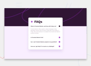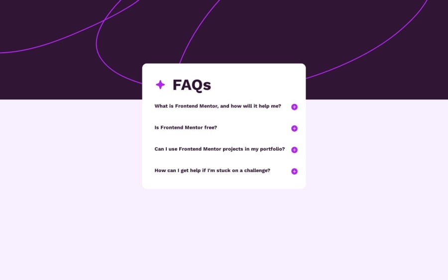
Design comparison
Solution retrospective
I ended up using some js for final touchs, I was hoping I'd only use CSS but I can't figure out how change the margin beetween clicks. Im not fully happy with the results, 'cause to me is a little messy, specially with the addition of Js. Any review is more than welcome.
Community feedback
- @justbycrisPosted 11 months ago
Hi Ale, I think it looks great! There are so many nice CSS touches I didn't think of using on mine that you did, so that was very insightful for me! The only thing I noticed, is that the responsiveness need a bit of work, try using relative units (rem, em, %, vh, vw...) in CSS to make everything more automatically responsive. Setting the width of the background image as well, I have a 16" inch screen and the background image cuts at like 70% width of my screen.
Great job though!
Marked as helpful0@AleprosDevPosted 11 months ago@justbycris I love that my challenge was hopefull to you. I will right away take your notes and improve, you are so right about responsiveness.
1
Please log in to post a comment
Log in with GitHubJoin our Discord community
Join thousands of Frontend Mentor community members taking the challenges, sharing resources, helping each other, and chatting about all things front-end!
Join our Discord