

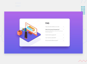
Design comparison
SolutionDesign

Solution retrospective
Hi ,
Let me know the ways I can improve my design.
Thanks
Community feedback
- @pikapikamartPosted over 3 years ago
Hey, great job on this one. Layout in desktop is smaller than the original but it's fine I guess. The responsive state could be improved as well , since right now changing the screen size, squeezes the layout in the center. Mobile layout is fine but could be longer.
Some suggestions would be:
- The gradient is supposed to be pointing upwards, so instead of using
to rightin thebackgroundprop inbodytag, use180deginstead. - The
imgthat you are using in the desktop layout is the mobile image, check it and make use of the desktop version's image. - The
altfor theimgshould have been left empty likealt="", since it is just a vector image, you don't really need to havealt. Also when usingaltattribute, avoid using words that relates to "graphic" like "illustration, picture, image..", it is already an image so no need to describe it as one. - On the
faqsection, instead of usingbuttonalone on those dropdowns, usedetailselement instead. This is more accessible than just using plainbuttonwith no extra accessibility feature added on it. - Also when you use
outline: noneyou remove visual indicators on an element. Users needs to have visual indicator so that they will know where are they when they are using your site. Try usingtabkey in your keyboard, you will notice that you can't see where you are. If you remove it, make sure to add other visual indicator in the:focus-visiblestate of the element. - Just a bug, when opening a question, the layout really changes its shape, I don't have a right fix for it, but refactoring your solutions would be really great. You can see other solution on this challenge as well, just visit the challenge hub of this solution, then on the
solutionstab, to see how others structure their site for this one.
Right now, just those mentioned above, still, you did a great job on this one.
Marked as helpful0 - The gradient is supposed to be pointing upwards, so instead of using
- @Biki-dasPosted over 3 years ago
mobile responsiveness is not working decrese your container width and it shall do the job
Marked as helpful0


Please log in to post a comment
Log in with GitHub
Join our Discord community
Join thousands of Frontend Mentor community members taking the challenges, sharing resources, helping each other, and chatting about all things front-end!
Join our Discord