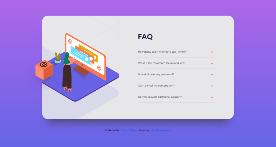
FAQ-accordion-card using JS and SASS RESPONSIVE
Design comparison
Solution retrospective
Did my best. Struggled with the image positioning specially when I resize the page and the image will move. Somehow manage to fix it though.
What are your thoughts on my solution for this challenge?
Community feedback
- @Kailash108Posted about 3 years ago
That's good and keep some a transition effect on accordion card open and close.
Marked as helpful0@Briancarlo24Posted about 3 years ago@Kailash108 I'm still learning with the transition effect. I tried adding it but it doesn't seem to work.
Any tips maybe?
0@Kailash108Posted about 3 years ago@Briancarlo24 will surely mention once I did this challenge👍
0 - @dwhensonPosted about 3 years ago
Hey @Briancarlo24 great work on this one! 🙌 the site looks good! 👍 Although you have managed without it, one thing that really helped me with this one was the use of the details and summary HTML elements.
These have much of the functionality baked in and can be styled with a little bit CSS work. This also has the advantage of including keyboard functionality and means that you don't have to worry about doing this yourself.
If you went with this approach you can also animate the opening and closing pretty simply using some code like:
details[open] summary ~ * { animation: sweep 0.2s ease-out; will-change: opacity, transform; } @keyframes sweep { 0% { opacity: 0; transform: translateY(-1em); } 100% { opacity: 1; transform: translateY(0); } }
The styling of these elements can seem a bit complicated at first, but there are some good resources out there. The page is a bit of a mess but I have found the following page to be a pretty good guide in how to style things, including the triangle indicator: https://webdesign.tutsplus.com/tutorials/explaining-the-details-and-summary-elements--cms-21999
Cheers 👋
Dave
Marked as helpful0@Briancarlo24Posted about 3 years ago@dwhenson This is really helpful, I've these HTML elements before but have never used it and never even thought about it while coding this challenge. This would have made it so much easier.
I will definitely use it in the future. Thanks for your helpful feedback. Appreciate it!
0
Please log in to post a comment
Log in with GitHubJoin our Discord community
Join thousands of Frontend Mentor community members taking the challenges, sharing resources, helping each other, and chatting about all things front-end!
Join our Discord