Design comparison
Solution retrospective
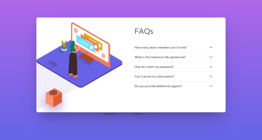
Please help me in positioning the illustrations. I'm stuck. Also, why is the background linear gradient getting messed up when I'm reducing the screen width in inspect?
Community feedback
- @NaveenGumastePosted almost 3 years ago
Hay ! Good Job you made it look nearly perfect to the preview
These below mentioned tricks will help you remove any Accessibility Issues
-> Add Main tag after body like it should be your container
-> For 1st heading or h1 tag, use header tag and then inside the header put your h1 or h2 etc
-> But use header tag only once in main heading element.
-> adjust the box as per the design
<img src=images/illustration-box-desktop.svg>
use alt atributeKeep up the good work!
0
Please log in to post a comment
Log in with GitHubJoin our Discord community
Join thousands of Frontend Mentor community members taking the challenges, sharing resources, helping each other, and chatting about all things front-end!
Join our Discord