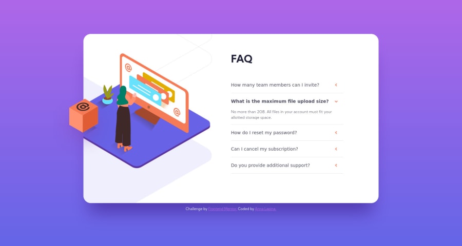
FAQ-Accordion-Card JavaScript and solution with React
Design comparison
Solution retrospective
Project was built with maximum accessibility in mind. Go and try clicking and tabbing through buttons! You even can try voice over!
Also, check out how I use pseudo-class :focus-visible to remove focus outline on mouse click on button, but add and make it visible on tabbing through buttons.
I build two variations - first with simple Vanilla JS and second with React. For a small component like this React is probably overkill, but as a complete beginner for me it was challenging and I learn a lot about React with hooks!
Repository URL for React solution: https://github.com/ALapina/FAQ-Accordion-Card-React
Live Site URL for React solution: https://alapina.github.io/FAQ-Accordion-Card-React
Community feedback
- @arturpawlowski5Posted over 3 years ago
Hi,
First - thank you very much for such a good example of this Challenge.
I based my work on your solution and I learn a lot by doing this. I hope this not break any rules - I'm new here and in Web Dev. Let me know if I break any rules.
I have one question now that I couldn't figure out.
_animation.scss
.faq__desc.show-description { height: 2rem; margin-bottom: 15px; }index.html
` <dd> <p id="faq1_desc" data-qa="faq__desc" class="faq__desc"> You can invite up to 2 additional users on the Free plan. There is no limit on team members for the Premium plan. </p>
</dd> `This code in _animation.scss and index.html is responsible for line height when the Question is open. Because of that Question can have just 2 lines to not disappear on the bottom.
How to manage this code better so there can be even 10 lines Question and this will not disappear on the bottom?
0@ALapinaPosted over 3 years ago@arturpawlowski5 Wow! Thanks for your comment! This made my day 😊 And very good question about height! And I don't have a good answer for this 🤔 My thoughts: We can try with display:none and display: block. But I didn't find a way how to animate display none and block properly :( I only managed to animate text opacity. Here is example:
.faq__desc {
  margin-left: -40px;
  padding-right: 17px;
  margin-top: 0;
  margin-bottom: 0;

  display: none;
  animation: example 500ms ease-out;
}

.faq__desc.show-description {
  display: block;
  margin-bottom: 15px;
}

@keyframes example {
  0% {
    opacity: 0;
  }

  100% {
    opacity: 1;
  }
}
Also, there is a good comment above to use summary and details. Maybe these tags are animated better 🤔 I will defiantly try next time with faq accordion on a next challenge
0 - @steventobenPosted over 3 years ago
The dl, dt, and dd tags seem unnecessary to me, use details and summary for accordions instead. If you're going for maximum accessibility, don't set font-size with pixels, or really just don't use pixels at all. Use relative units for almost everything. Also the entire containing box grows when an accordion is toggled open. And one small detail is that an "Accordion" component should only allow one (or zero) in the set to be open at once. But it looks good otherwise!
0@ALapinaPosted over 3 years ago@steventoben Thanks for the comments and good tips! It really helps to learn more and push forward my skills! I will try to take all this into account in the next challenge!
0
Please log in to post a comment
Log in with GitHubJoin our Discord community
Join thousands of Frontend Mentor community members taking the challenges, sharing resources, helping each other, and chatting about all things front-end!
Join our Discord
