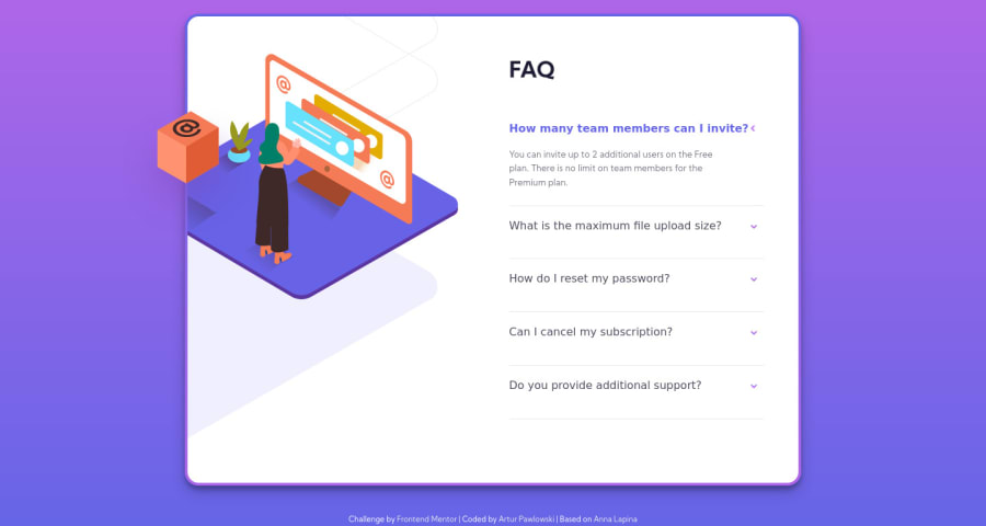
Design comparison
Solution retrospective
My Second Challenge Here.
I make the final look a little different from Challenge Files.
- add a border around Card
- make different shadows
- change arrows color
- add some other little changes
All the work I based on Anna Lapina FAQ Accordion Card. Learn a lot by doing this.
I have one question now that I couldn't figure out.
_animation.scss
.faq__desc.show-description { height: 4rem; }
index.html
`<dd> <p id="faq1_desc" data-qa="faq__desc" class="faq__desc show-description"> You can invite up to 2 additional users on the Free plan. There is no limit on team members for the Premium plan. </p>
</dd> `This code in _animation.scss and index.html is responsible for line height when the Question is open. Because of that Question can have just 3 lines to not disappear on the bottom.
How to manage this code better so I can have even 10 lines Question and this will not disappear on the bottom?
Community feedback
- @dwhensonPosted over 3 years ago
Hi @arturpawlowski5 nice work on this one.
Setting heights on elements is generally best avoided where possible. As you've seen it can solve one problem but create a whole host of others. Also transitioning
heightcan cause a few performance issues and all the other elements to adjust position (jank), which is not ideal.I would consider trying the
detailsandsummarytags as and alternative to thedloption. These tags have a lot of the functionality you are looking for built in, and will solve your height issues. If you combine this with some styles to the::markerpseudo element you can make it look nice too!I recently used these tags on this page and I found it worked well. https://frontend-mentor-coffeeroasters.vercel.app/plan.html
Keep up the good work!!
1
Please log in to post a comment
Log in with GitHubJoin our Discord community
Join thousands of Frontend Mentor community members taking the challenges, sharing resources, helping each other, and chatting about all things front-end!
Join our Discord
