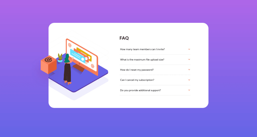
Design comparison
SolutionDesign
Solution retrospective
Another submission on Frontend mentor. Please let me know where I can improve.
Community feedback
- @kenreibmanPosted about 3 years ago
Great job! Just a quick suggestion:
I would recommend wrapping your entire content in a
maintag to get rid of your accessibility issues. It's just good practice for correct semantic HTMLIn your case it would be
<main>
<section class="card">
...
...
</section>
</main>
Don't forget to generate a new report to get rid of the accessibility issues!
Marked as helpful0
Please log in to post a comment
Log in with GitHubJoin our Discord community
Join thousands of Frontend Mentor community members taking the challenges, sharing resources, helping each other, and chatting about all things front-end!
Join our Discord
