Design comparison
Community feedback
- @PillinPosted about 3 years ago
Hi!!!
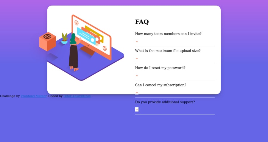
when you defined the H2 tag, you didn't close it, that makes it look dropped.
<h2 class="question">How many team members can I invite?</p><button title="open answer" class="toggle-button"><img src="./images/icon-arrow-down.svg" alt=""></button>I suppose that you want to do is
<h2 class="question">How many team members can I invite?</h2>
<button title="open answer" class="toggle-button">
  <img src="./images/icon-arrow-down.svg" alt="" />
</button>
With the flex that you have in the parent. you will have the alignment correctly
I hope it has been helpful
Marked as helpful0@peter-kalavritinosPosted about 3 years ago@Pillin Thank you! This helps. The only other two things I'm having trouble with are the fonts not showing up and the footer being in the wrong place. How can I fix this?
0@PillinPosted about 3 years ago@peter-kalavritinos Sure!, the fonts is because It isn't in the route that you put, if you see network tab in the inspector. you will see the request is 404. Other way that you can import a font is
@import url("https://fonts.googleapis.com/css2?family=Kumbh+Sans:wght@400;700&display=swap");Remember put this in the .css in the beginning and also put that you use this font, you can add in the body or in the tag that you need
body {
  font-family: "Kumbh Sans", sans-serif;
}
Also, if you need more fonts you can search in https://fonts.google.com/ , you can search and choose that you want. That page say you how to import it.
In the footer, it happens that need to be centered, you can add in the div
text-align: center;
In Mobile, you can set the height of .card as
height: 100%with that, it doesn't happen that the content comes off from the card
Marked as helpful0@peter-kalavritinosPosted about 3 years ago@Pillin Thank you so much! This all helps a lot. It still looks a little weird on mobile view. Is there anything else I can do to fix that?
https://peter-kalavritinos.github.io/faq-card/
0@PillinPosted about 3 years ago@peter-kalavritinos yes!
You can add padding in the question/answer, also put the
background: transparentin the button with the arrow, and use the option :last-of-typehttps://developer.mozilla.org/es/docs/Web/CSS/:last-of-typeto remove the border-bottom in the last question. I think with that it is ok =)0@peter-kalavritinosPosted about 3 years ago@Pillin Perfect! Thank you so much! :)
1@PillinPosted about 3 years ago@peter-kalavritinos your welcome, I'm glad to help!
0
Please log in to post a comment
Log in with GitHubJoin our Discord community
Join thousands of Frontend Mentor community members taking the challenges, sharing resources, helping each other, and chatting about all things front-end!
Join our Discord
