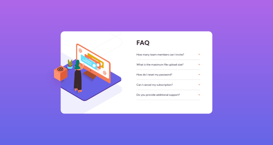
Design comparison
Solution retrospective
This is my first attempt at integrating JS and HTML/CSS. I thought the layout looked pretty simple but it ended up taking me alot of time to place the box correctly, I finally got something that works but I am not 100% happy with how I implemented it as my design feels less responsive than it should be. What would be your suggestion for the best way to place the 2/3 images correctly.
As for my JS code I am disappointed with my writing of the code I attempted to use arrays and iterators to clean up the code but struggled to get my elements into arrays, because of this I ended up with VERY long bloated code with lots of unnessercary repeats.
I imagine the whole thing could be done using one function iterator through the elements. I would love to see an example of clean simple code to this problem so I can study it so on the next challenge I can write much better JS.
I am however happy that I have working code as this is my first attempt.
Community feedback
- @dwhensonPosted almost 3 years ago
Hey @AaronCurrie - good work on trying this with JS, and don't be disappointed. IT WORKS!!! Everything else is extra! š„³
But whenever you have a lot of functions that do exactly the same thing (as you have here) you know that the code is ripe for a refactor!
There will be many ways to go about this, but I would use "event delegation". In this approach you add just one event listener to a parent element, then when it's clicked get the
event.target
which returns the clicked element (some validation may be needed...)You can then pass the
event.target
through your function. This would enable you to do away with most of the variables you set at the start, and reduce the main functions to just one function that handles all the clicks. It's a super useful technique and worth reading up on.BUT!! You can actually do this without JS at all... through the use of the details and summary HTML elements.
These elements have much of the functionality baked in and can be styled with a little bit CSS work. This also has the advantage of including keyboard functionality and allow the key elements to be focusable automatically.
If you went with this approach you can also animate the opening and closing pretty simply using some code like:
details[open] summary ~ * { animation: sweep 0.2s ease-out; will-change: opacity, transform; } @keyframes sweep { 0% { opacity: 0; transform: translateY(-1em); } 100% { opacity: 1; transform: translateY(0); } }
The styling of these elements can seem a bit complicated at first, but there are some good resources out there. The page is a bit of a mess but I have found the following page to be a pretty good guide in how to style things, including the triangle indicator: https://webdesign.tutsplus.com/tutorials/explaining-the-details-and-summary-elements--cms-21999
Great work and keep going!! š
Cheers š
Dave
1 - @IamparvesPosted almost 3 years ago
Hello @AaronCurrie, I saw your code and it was a very static code. Everything was manually selected and you did same tasks repeatedly. Now if you add another question in your html, you have to change your Javascript code again.
You can avoid this by using
querySelectorAll
to select all the elements and convert it into an array. You can useArray.from()
or spread operator[...]
. Then you can loop over the array and add event listener or you can just add event listener in the parent element.Also it will be better if you handle design changes using CSS class rather than changing it from Javascript.
You can look for more solutions of this challenge in the SOLUTIONS page. And You can see my solution if you want: FAQ Accordian Card
0
Please log in to post a comment
Log in with GitHubJoin our Discord community
Join thousands of Frontend Mentor community members taking the challenges, sharing resources, helping each other, and chatting about all things front-end!
Join our Discord