

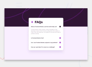
Design comparison

Solution retrospective
Managed to get the Javascript part faster than before, slowly getting better at it!
What challenges did you encounter, and how did you overcome them?I struggled with the responsiveness of the project - anything that's not 1920 or 375 aka desktop or mobile, looks real bad, and have yet to figure out why.
What specific areas of your project would you like help with?Any feedback works!
Community feedback
- @kodan96Posted 6 months ago
hi there! 👋
Since you applied a huge margin on your
#main_containerit gets squished on small and mid-size screens. If you want to center your content you can do it with making thebodytag a flex-container:body { display: flex; justify-content: center; min-height: 100vh; }you can declare
max-widthon your container to prevent it from stretching the full screen-width.Instead of putting the image in an actual div you can set it as a
background-colorto the body tag.Hope this helped 🙏
Good luck and happy coding! 💪
Marked as helpful1@mihainrsPosted 6 months agoHey @kodan96!
I tried applying display:flex to the body but the image was part of the reason I had to resort to using such big margins. I tried lots of things and not much worked sadly.
I didn't know about the image being set as a background-color though. I'll look into it and see how that can be done, so really great advice, thank you!
1@kodan96Posted 6 months ago@mihainrs
sorry, it's
background-image, not color. I went autopilot 😂0

Please log in to post a comment
Log in with GitHub
Join our Discord community
Join thousands of Frontend Mentor community members taking the challenges, sharing resources, helping each other, and chatting about all things front-end!
Join our Discord