

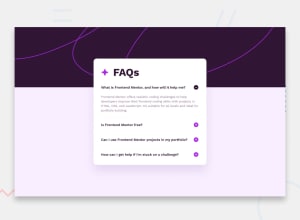
Design comparison
SolutionDesign

Community feedback
- @grace-snowPosted 6 months ago
I'm afraid you need to rewrite this with the correct html. It's inaccessible at the moment because you've not used interactive elements (try using with a keyboard and you'll see it's non-functional)
You must build disclosures like this using an aria-expanded button. I've written a post about this disclosure UI.
You also need to
- contain all content within landmarks. This should all be inside a
main. - keep alt blank on decorative icons.
- Indent code consistently so it's easier to read and spot bugs. Your code editor can even do this formatting automatically for you with prettier.
- stop using JS to manipulate inline styles. This would become a nightmare to maintain on larger projects and isn't necessary when all styling can be handled in a performant way in the css. All the js needs to do is toggle an aria- value, and optionally you can toggle a class or data attribute if you don't want to use the aria value as your styling hook in the css. (Again this is covered in the linked article).
- the js should also loop over all.the buttons when you've added them. Don't select every FAQ separately and repeat loads of code. This challenge only needs a few lines.
- import fonts in the html head instead of css imports for better performance.
- get into the habit of including a full modern css reset at the start of the styles in every project. Andy Bell or Josh Comeau both have good ones you can look up and use.
- font size must never be in px. Use rem.
- only use flexbox when you actually need it. The heading doesn't need it.
- try to use single class selectors much more than element selectors in css. It's lower specificity and means the styles won't break when you have to change the html like you do here.
- the comment is incorrect above your media query. If it was targeting screens "at least 600px wide" that would imply a min-width media query.
- that said, you should be making the mobile styles the default, then using a min-width media query to target larger screens and Change properties that need to change. The mobile styles should not be in a media query at all.
- when you do use media queries they should always be defined in rem or em not px. This means the layout will scale correctly for all users including those who have a different text size.
- don't limit the height of any elements that contain text. It is a serious problem to limit the component height to a px value. It will break as soon as someone changes text size in their browser or an author changes the length of a question or answer. In fact it already breaks on my phone if I open all questions because the height has been limited so answers get cut off. Let the browser do it's job and decide what height is needed.
- the backgrounds shouldn't have an explicit width and height either. You can size them to full the space. If something is a background only it can have a height or min-height but shouldn't have a width.
0 - contain all content within landmarks. This should all be inside a

Please log in to post a comment
Log in with GitHub
Join our Discord community
Join thousands of Frontend Mentor community members taking the challenges, sharing resources, helping each other, and chatting about all things front-end!
Join our Discord