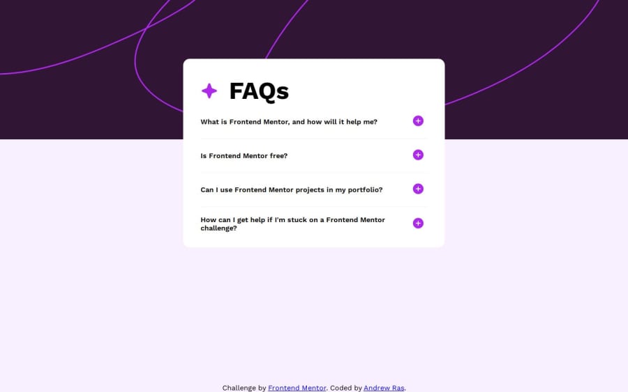
Design comparison
Solution retrospective
Building the button functionality really taught me a lot about structuring HTML and how it can really affect your JavaScript (I went through three different structures, the first one used two buttons which would hide each other, until I realized I could have one button do two things depending on which icon is shown). What I'm wondering is this: is there a better way to navigate through siblings and children in HTML tags? Because in my code I refer to the "plus" and "minus" icons as button.children[0] and I figure there must be some kind of method that lets you access them in a less ambiguous way.
I also want to know if there is a way to add padding to the bottom of the page when the accordion is fully extended? It seems a little awkward to have the content be stuck at the bottom of the page and whenever I added padding or margins to the body it would produce an unnecessary scroll wheel despite all the HTML being set to "display: none" in my CSS.
Lastly I (finally) noticed that all of the style guides that are given are 1440px wide, which is weird to me since it's squarely between 720p and 1080p monitors. I'm just curious, is there a reason for this? Because it makes it a bit weird to tinker and try to get the styles to match.
Community feedback
Please log in to post a comment
Log in with GitHubJoin our Discord community
Join thousands of Frontend Mentor community members taking the challenges, sharing resources, helping each other, and chatting about all things front-end!
Join our Discord
