Design comparison
SolutionDesign
Solution retrospective
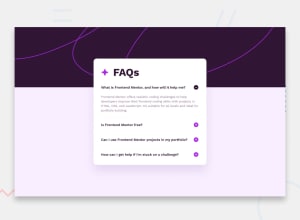
when I try to zoom out, it can be seen that the element card is separated from the background image, and it can also be seen that there are gaps on the right and left of the background image
the question:
- Is that normal?
2.if not, is there a solution? because I tried to solve this problem myself but couldn't find a solution
Community feedback
Please log in to post a comment
Log in with GitHubJoin our Discord community
Join thousands of Frontend Mentor community members taking the challenges, sharing resources, helping each other, and chatting about all things front-end!
Join our Discord
