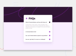
Design comparison
Solution retrospective
I tried with JS but, run into problems when doing two functions for each clickable element
Community feedback
- @MelvinAguilarPosted 11 months ago
Hello, first of all, congratulations on completing this challenge!
I've reviewed your code and noticed a few things I'd like to highlight:
- The
<a>tag is meant for links to direct users to another page or section of your website. However, you've used too many, and you shouldn't because clicking should performs an action. In such cases, it's better to use the <button> tag.
- Enclose both the icon and the text in a SINGLE
<button>tag to avoid duplicating the open/close effect.
- A simpler way to approach this challenge is to use
<details>and<summary>, which allow you to achieve this without the need for JavaScript.
- Regarding the JavaScript code, I would suggest making the other element visible or invisible without modifying its height.
I hope you find it useful! 😄
Happy coding!
Marked as helpful0 - The
- @danielmrz-devPosted 11 months ago
Hello @MisterCcobD!
Your project looks really good!
I just have one suggestion:
- You don't need a separate container to create that background pattern. You can use both
background-colorandbackground-imagetogether on the body. They will not cancel each other.
I hope it helps!
Other than that, great job!
Marked as helpful0@MisterCcobDPosted 11 months ago@danielmrz-dev Would be so nice actually, i really tried, if you can see now, the firs background barely starts to repeat when i explicitly tell not to
body { background-image: url(assets/images/background-pattern-mobile.svg); background-color: var(--LightPink); background-repeat: no-repeat; background-position: center; background-size: cover; background-blend-mode: color; margin: 0; padding: 0; }1@MisterCcobDPosted 11 months ago@danielmrz-dev AAAAannnndd it breaks the whole mobile version i will revert to what i know it worked I prefer to not rework now, but i'll keep in mind for future.
1@danielmrz-devPosted 11 months ago@MisterCcobD
Try removing the
div#topand working only with the body background.Let me know when you update it so I can take another look at it
0 - You don't need a separate container to create that background pattern. You can use both
- @Serdarq1Posted 11 months ago
Hi, what kind of problems you ran into? If you tell me I can do my best to help you out.
0@MisterCcobDPosted 11 months ago@Serdarq1 I added the index2.html and style2.htm to check I tried to kinda solve something but done nothing :( ToggleImage works but first click loads th js code after that really wrorks and i tried to fix the accordion but actually ended killing it.
0@Serdarq1Posted 11 months ago@MisterCcobD I checked your index2.html and i think the way you are doing is more complex than it should be. I suggest you just create a container for each question and answer so that it will be easier for you to implement javascript. For example, you can create a container for first question and make the answer section invisible and when clicked on the question you can make the answer section visible. You can do that by using addEventListener and then you can use forEach to write less code. And I suggest you create a separate js file
1
Please log in to post a comment
Log in with GitHubJoin our Discord community
Join thousands of Frontend Mentor community members taking the challenges, sharing resources, helping each other, and chatting about all things front-end!
Join our Discord
