Design comparison
SolutionDesign
Solution retrospective
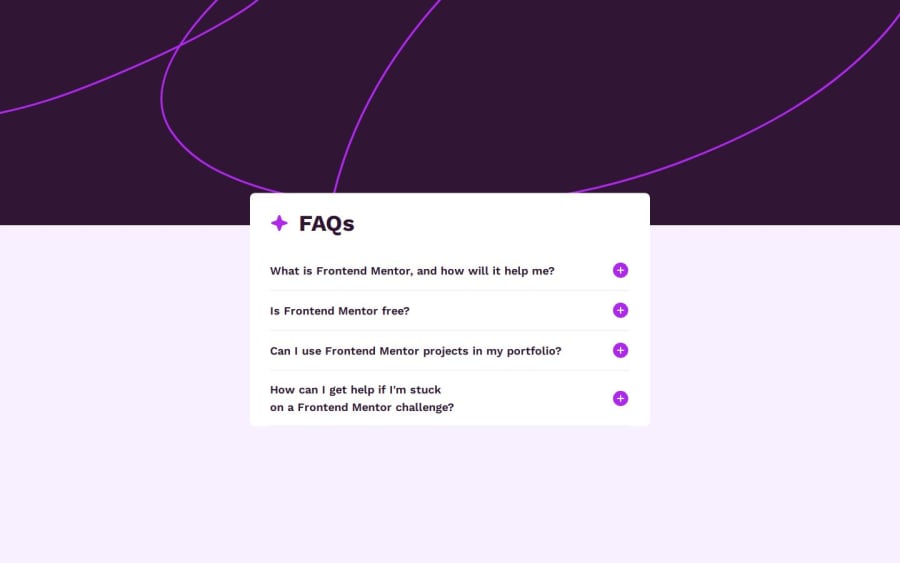
Hi guys, I'm begging you for advice. I am not sure how to make mobile design properly. It looks ok on the desktop, but on mobile devices?..meh..I did an accordion so I'm happy, but other things are not perfect and I can't live with it :D
Community feedback
Please log in to post a comment
Log in with GitHubJoin our Discord community
Join thousands of Frontend Mentor community members taking the challenges, sharing resources, helping each other, and chatting about all things front-end!
Join our Discord
