Design comparison
SolutionDesign
Community feedback
- @smalanceaPosted 11 months ago
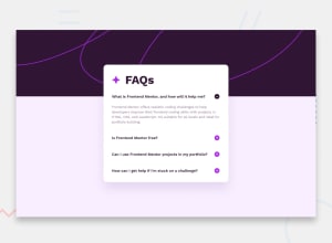
I think your solution is a little bit different than the original one. Have you tried starting with the basic main containers and working your way to the smaller components? The font size is also different and the font weight too. I think overall looks good but you just need organize it a little better.
Marked as helpful0
Please log in to post a comment
Log in with GitHubJoin our Discord community
Join thousands of Frontend Mentor community members taking the challenges, sharing resources, helping each other, and chatting about all things front-end!
Join our Discord
