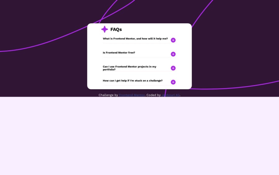
Design comparison
SolutionDesign
Solution retrospective
if u have any feedback please tell me
Community feedback
- @MelvinAguilarPosted 11 months ago
Hello there 👋. Good job on completing the challenge !
I have other suggestions about your code that might interest you.
- The content should expand when clicking on the paragraph, not just the icon. Additionally, you can implement a design where the user sees a change when hovering over the paragraph. Also, consider adding hover styles for better user feedback, as shown in the "active-states.jpg" image.
- Elements that perform an action, such as opening an accordion, should be buttons to allow users to access them through the keyboard. Also, note that <h2> is not an interactive element.
- You should use the
cursor: pointerproperty to indicate that the element is clickable.
- The fonts are too small; it's rarely a good idea to have fonts below 16px or 1rem. It makes reading the text difficult.
I hope you find it useful! 😄
Happy coding!
1
Please log in to post a comment
Log in with GitHubJoin our Discord community
Join thousands of Frontend Mentor community members taking the challenges, sharing resources, helping each other, and chatting about all things front-end!
Join our Discord
