

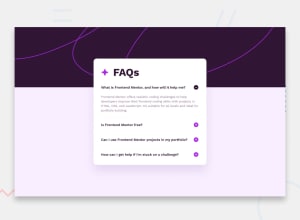
Design comparison

Solution retrospective
Welcome
This project takes me a whole night, hope it can help you guys!
Community feedback
- @CoderHaqiimPosted about 1 year ago
Congratulations on completing your challenge. I love the simplicity of your code (the js part) also the use of ’this' keyword. However, the page is not responsive on mobile. Also, you can add to your challenge by closing the already opened answer when you open a new one. Cheers! Happy coding!
Marked as helpful1@s-zxPosted about 1 year ago@CoderHaqiim Thanks for your comment. I don't know how to make my page be responsive on mobile.
1@CoderHaqiimPosted about 1 year agoYou have to use media queries. Read up about them. A media query in css is used to set specific style instructions to be carried out at different screen width. e.g
@ media only screen and (min-width:376px){
    Some style here..
}
This specifies styles to be used for the page, but the minimum width for that to happen is 376px. That means when the screen width is less than 376px in disregards the code in this block and falls back to default. You should read about the rules. Also learn how to create external JavaScript and CSS files if you don't, as it's better to have them all in different files. Here is a good resource on media queries w3schools mediaquery Cheers! Happy coding!
Marked as helpful1@s-zxPosted about 1 year ago@CoderHaqiim Really appreciate your reply, I will learn this stuff later. Thank you so much.
1 - @Bishalsnghd07Posted about 1 year ago
Hi, @s-zx 👋
Congrats for completing this challenge🎉
You did great work, but I would recommend to work on little bit more on responsiveness, you directly giving
heightin your body of web page, which cause severe issues, your layout may break. For that I would recommend to read this doc, for your better experience 👉 Modern CSS1@s-zxPosted about 1 year agoHi, @Bishalsnghd07
Thanks for your advice, I will go through this doc later. Have a good day.
0


Please log in to post a comment
Log in with GitHub
Join our Discord community
Join thousands of Frontend Mentor community members taking the challenges, sharing resources, helping each other, and chatting about all things front-end!
Join our Discord