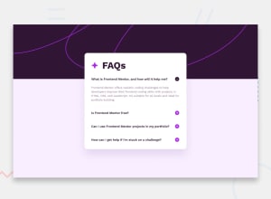
Design comparison
Solution retrospective
First time in months that I touched basic CSS and HTML since I've been learning backend and React. Took about 7 hours, which is 5 hours longer than I thought, I had to have a lot of reminders but it was good practice. Getting the plus buttons to the right took longer than I want to admit, as well as getting the keys to navigate the questions.
Looking for any feedback on my CSS and Javascript code!
Community feedback
- @DeanogitPosted 11 months ago
Hi @tbeagle2,
Great job submitting this solution
I was just taking a look at your code and found something you might be interested in, really small details, but thought I'd share them
In the
<body></body>element, its best practice to include a<main></main>element for screen readers and accessibility, the first ´<div></div> could be swapped for<main></main>And just a couple of tiny detail in your CSS,
- to add a
cursor: pointer;to the.question:hover - adjust the media query around the >400px width to allow more space for the text
All said, it's looking great
Marked as helpful1@Jalex-McPosted 11 months ago@Deanogit
Thank you! I originally have a main element but deleted it, it's good to know that it should included. I never knew there was a reason to use main, it seemed interchangeable. I added cursor pointer, I didn't know that property existed. I increased the media query size to 400, the style design had it at 375, but it does seem really small so it's a welcome change. Thanks again for the feedback!
0 - to add a
Please log in to post a comment
Log in with GitHubJoin our Discord community
Join thousands of Frontend Mentor community members taking the challenges, sharing resources, helping each other, and chatting about all things front-end!
Join our Discord
