Design comparison
Solution retrospective
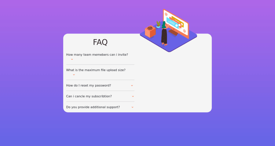
I have a problem with reversing the sections since i started with the mobile version first. please someone should help me in this
Community feedback
- @MooseCowBearPosted over 1 year ago
It looks like what's happening is that you have made the mobile layout with two columns (display flex defaults to row so the mobile layout has two sections next to one another) and then you force the image to be above the text section by using absolute positioning. Then when you move to the desktop layout, the absolute positioning is still doing what you've told it to do but now the "top: -130px, right: 10%" is that upper right hand corner.
If you want to stick with Flexbox, what you want to do is ditch the absolute positioning and instead use "flex-direction: column" to position the image above the text in the mobile view. Then in the desktop view, switch it back to row.
0
Please log in to post a comment
Log in with GitHubJoin our Discord community
Join thousands of Frontend Mentor community members taking the challenges, sharing resources, helping each other, and chatting about all things front-end!
Join our Discord
