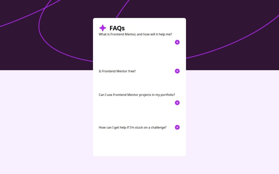
Design comparison
Solution retrospective
managing to complete without javascript figure out why the font and padding could not work together
What challenges did you encounter, and how did you overcome them?getting the button to work: googling and changing checkbox appearance to none.
making the answer appear: using the right selector
background image: changing the position of both divs. and playing around with the top
I want to know if there is a better way to do the semantic html for the unordered list making the padding and font change work because I dont know why the last 2 get pushed to the right.
Community feedback
Please log in to post a comment
Log in with GitHubJoin our Discord community
Join thousands of Frontend Mentor community members taking the challenges, sharing resources, helping each other, and chatting about all things front-end!
Join our Discord
