Submitted 9 months ago
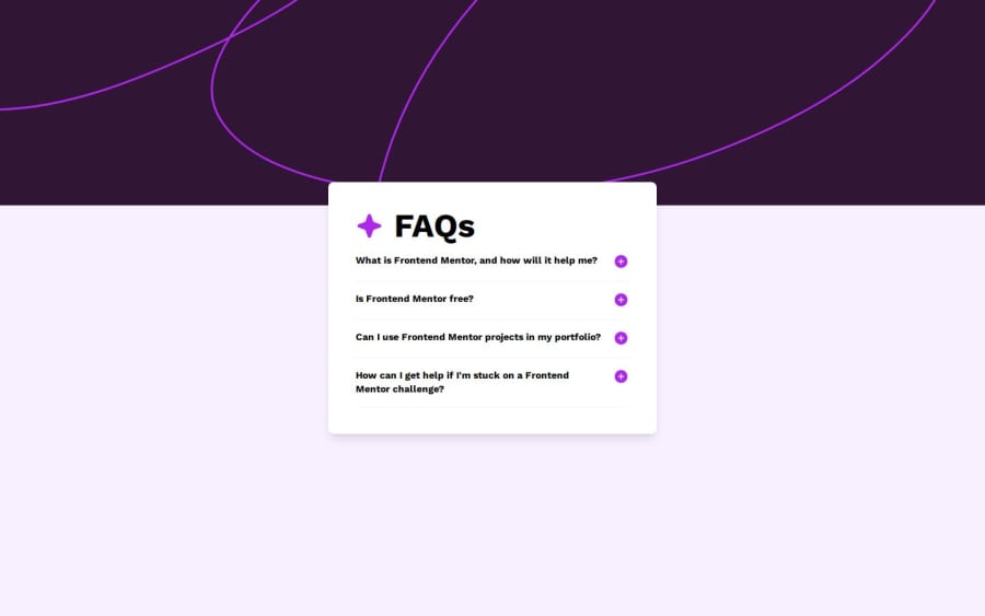
FAQ responsive webpage
#react#vite#tailwind-css
@saptarsidebnath98
Design comparison
SolutionDesign
Solution retrospective
What are you most proud of, and what would you do differently next time?
I am proud of replicating 99% of the given assignment design. I will spend less time designing.
What challenges did you encounter, and how did you overcome them?The plus /minus icon size was different for every element. After finding the issue I divide h2 and button elements into two divs. That helped me.
What specific areas of your project would you like help with?Whenever FAQ expands, it can occur that the first and last questing can be hidden which I did not solve.
Community feedback
Please log in to post a comment
Log in with GitHubJoin our Discord community
Join thousands of Frontend Mentor community members taking the challenges, sharing resources, helping each other, and chatting about all things front-end!
Join our Discord
