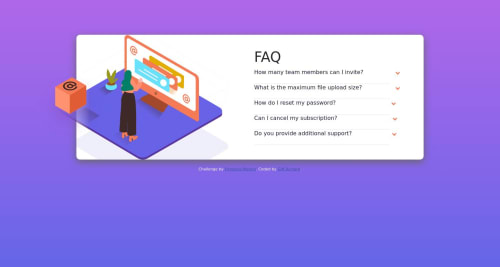
Design comparison
Solution retrospective
Although using CSS alone worked, it was a little buggy. I would appreciate any feedback you may have on it
Community feedback
- @Julie-GzPosted over 1 year ago
Hi Gift. I agree with Timothy, you might need to add more media queries. There are 5 common break points: <481px for mobile devices 481px - 768px for Ipads and Tablets 769px - 1024px for small screens and laptops 1025px - 1201px for desktops
1201px for Extra large screens.
Try creating media queries for these break points and hopefully it will fix the issue. It's also important to pay attention to semantics when writing code. While your code is good, it is best to use proper semantics because it helps browsers better interpret the content of the page, which is important for accessibility. You can start by wrapping your code in a main element instead of a div. I hope you find this helpful. All the best with your journey :)
1 - @timbosToursPosted over 1 year ago
Nice job my friend, never hurts to throw in an extra media query or 2. or you could just adjust your current media queries breakpoint. go up too 1000px then move it up or down from their until everything fits nicely. hope that helps! happy coding!
1
Please log in to post a comment
Log in with GitHubJoin our Discord community
Join thousands of Frontend Mentor community members taking the challenges, sharing resources, helping each other, and chatting about all things front-end!
Join our Discord