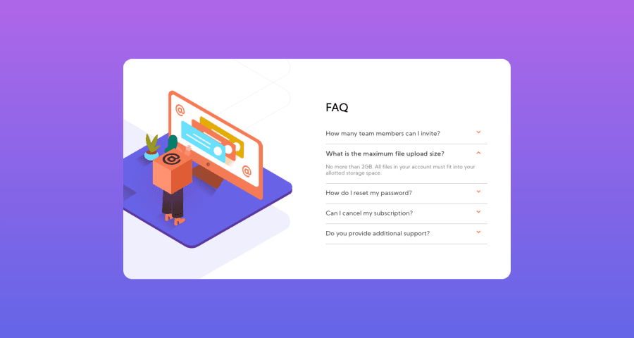
Design comparison
Solution retrospective
Decided to share though I still have some work to do to make it very responsive on all screen sizes. If you notice anything I need to add, please, feel free to share. I'd love to hear and learn from you. Thanks.
Community feedback
- @ApplePieGiraffePosted over 3 years ago
Hi there, John_diddles! 👋
Good effort on this challenge! 👍 I like the way the floating cube moves around in the desktop layout! 😀
Like pikamart mentioned, adding functionality to the accordion card would be a good idea! 😉
Also, I suggest switching to a mobile-friendly layout quite a bit sooner to prevent the accordion card from becoming too squished right before the layout changes from desktop to mobile. 🙂
Keep coding (and happy coding, too)! 😁
1@JohndiddlesPosted over 3 years ago@ApplePieGiraffe Hi, Thanks for your feedback. I have now adjusted my code. The page now switches to mobile layout at 720px. Also, the accordions have been fixed. Thanks for your positive contribution to my experience here.
1 - @pikapikamartPosted over 3 years ago
Spot on. It really looks great in the layout, but one flaw. Those was supposed to be accordions right, on the right side with the questions but you didn't implemented it but still you got the looks of target just the functionality right. Maybe try to reimplement it but now accordions will be implemented as well, you could make use radio buttons in there without using js only css that would be great but you could as well use js. You could look out for other submission on this one and take note of their accordions if you are new to it, haven't made this challenge so I have no reference of my own hahaha goodluck ^^
1@JohndiddlesPosted over 3 years ago@pikamart woow! I didn't even consider the accordions at all. I was so focused on the layout. I can use bootstrap or JS to fix this. Thanks for that observation. I'll get that fixed right away.
0@pikapikamartPosted over 3 years ago@Johndiddles Oh I do that sometimes too hahah forgot there are components. Wll goodluck for it and update the site as well if you have the time to finish it^
0@JohndiddlesPosted over 3 years agoHi, Pikamart, thanks for your feedback. I have now fixed the accordions on the page. You can check it out and let me know if there's anything else I can improve on.
Much love 😘
0@pikapikamartPosted over 3 years ago@Johndiddles You really did refactored it well done! I looked into it and it functions well, the container also do not get resized when selecting accordions points for that, a lot of submission have that issue.
There seems to be a scrollbar at the bottom when I resizes at point 957px going down to your breakpoint. As I looked into your css, the declaration of
padding: 20px
in yourcontent-wrapper
selector is the one causing it. A good way to prevent this would be addingboz-sizing: border-box
in yourcontent-wrapper
. What it does is, it will make sure that your padding will stay at the box of your content, it will not make you elements be pushed in different ways, they will be capped by their dimension. A good suggestion would be to make your temple, your whole css add this stylinghtml { box-sizing: border-box; } *, *::before, *::after { box-sizing: inherit; }
This will make sure all your elements will have a security in their sizes, when adding paddings something like that.
After I reached the breakpoint, there is another scrollbar, well to fix this. You just remove the
width: 100vw
in yourcontainer
selector.Also why were at it, we personally avoid adding our javascript inside an html, instead we make a separate file for it. Sample would be that
script.js
, that will be our javascript file. Then to add it right, right before the ending of your body tag, you declare it. Like this<body> <--contents--> </body>
The src will be the path of your javascript.
Phew, well your work is really good even if those small issues persist. Glad that you really refactored it^^
1@JohndiddlesPosted over 3 years ago@pikamart wow, wow, wow. I should frame this feedback/observation 😁. Thank you 🙏. I'll work on this and consider this tip in all other projects.
0@JohndiddlesPosted over 3 years ago@pikamart again, thanks for your feedback. All observations have now been addressed. Thanks.✌
0@pikapikamartPosted over 3 years ago@Johndiddles Glad to hear it and I noticed that I mistyped about the script tag hahahahah sorry for that. But it is good that you made it really glad for that^^
0
Please log in to post a comment
Log in with GitHubJoin our Discord community
Join thousands of Frontend Mentor community members taking the challenges, sharing resources, helping each other, and chatting about all things front-end!
Join our Discord