Design comparison
Solution retrospective
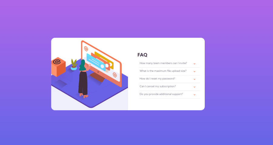
Has anyone got any advice specifically regarding the images for this one? Should I have used entirely Flexbox instead of Grid? It's extremely satisfying watching everything move as the container expands but I'm pretty frustrated I couldn't stop the images from being cut off - even using multi-background image didn't seem to work properly this time around, especially regarding background-size.
My hovers also seem to have broken and I don't know why. :( Feedback appreciated!
Community feedback
- @kabir-afkPosted over 1 year ago
hey! Look I don't know much about JS since I'm learning it as of now but I can comment on your CSS ., look it is subjective what you use...use whatever suits you , I'm personally a fan of flex-box (since it is a flexible-box ) but if you are comfortable playing with grid then go for it....regarding your hover states.., you've used wrong colons that's why your code isn't working, same can be said for your after element....before/after are pseudo classes hence their syntax goes like
::afterwhereas hover, click are selectors and their syntax goes like:hoverAlso I think you are unable to upload your designs and images folder , and hence you have to upload them individually...try dragging and dropping them.., it worked for me..
Hope this helps
1 - @allmtzPosted over 1 year ago
Congrats on completing the challenge it looks great !
I think the broken hover effects are because of an extra semi-colon. Try changing
.faq-question::hoverto.faq-question:hoverLet me know if that helps
1
Please log in to post a comment
Log in with GitHubJoin our Discord community
Join thousands of Frontend Mentor community members taking the challenges, sharing resources, helping each other, and chatting about all things front-end!
Join our Discord
