Not Found
Not Found
Not Found
Not Found
Not Found
Not Found
Not Found
Not Found
Not Found
Not Found
Not Found
Not Found
Not Found
Not Found
Not Found
Not Found
Not Found
Not Found
Not Found
Not Found

Submitted

FAQ Card

Trey 290

@willetto

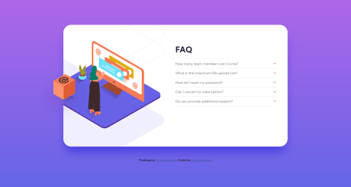
Desktop design screenshot for the FAQ accordion card coding challenge

This is a solution for...

  • HTML
  • CSS
  • JS
1newbie
View challenge

Design comparison


SolutionDesign

Solution retrospective


Update: Thank you for all the comments and links to helpful resources. I was able to fix both issues, although the animation isn't as smooth as I'd like it. I was able to implement a version of Christian's idea within my main element.

//Original Post I have two areas I need help in:

  1. How can you consistently place the floating box in about the right area?
  2. How can you change an element, like the answers, from display: hidden to display: grid and have it transition in nicely?

Thanks for your help and feedback!

Community feedback

@gfernan24373

Posted

Hey!! nicely done!!! I gonna submit this challenge in a couple of hours, it was so hard but no imposible positioning the @ box, you can use position relative and absolute with relative values for the properties like width, height and the position for the top, botton, right and left. Feel free to review this material that I founded to solve this issue https://codepen.io/graup/pen/EPjNwr.

In the JS document you can set the properties for the faqs answers in this case p tags. I don't know why the js script file cannot read the properties in the css files directly. I founded sites explaining the getComputedStyle and getPropertyValue methods to read the properties in the .css file but looks to hard to implement. if you select a p tag like this in the js file:

let faqs = document.querySelectorAll('.p-faq'); //Select all the p tags for (answer of faqs) { console.log(answer.style.display): } //Console =

So... All the properties are empty and you need to set it again like this: for (answer of faqs) { answer.style.display = 'none'; } . . ...rest of the code here And now, you can do whatever you want.

Marked as helpful

0

@fosteeco

Posted

The way I'd fix this is by creating a wrapper around the main tag with the same width. .main-wrapper { position: relative; width: min(100% - 8rem, 920px); } This container wraps around the main tag so it's like this:

<div class="main-wrapper"> <main class="container">...</main> </div>

This should fix the issue. I created a pull request on your repo if you want to try this solution. Looks good though.

One thing I think is an issue is the pulldowns extending the size of the container on smaller screens when they are opened. It seems kind of jarring.

Marked as helpful

0

Trey 290

@willetto

Posted

@fosteeco Hmm, I think this would work, but doesn't look very clean. I might try your idea, but using the ::after psuedo-element instead. I'm pretty sure it acts in a similar way to wrapping it.

And I agree that the pulldowns changing the size is abrupt, that's why I want to add a transition/slide-in effect. I think that & maybe adding a touch more space will solve the issue. Thanks for your feedback!

0

@Kamasah-Dickson

Posted

Don't forget to add the box shadow to the main container

Marked as helpful

0

Trey 290

@willetto

Posted

@Kamasah-Dickson It shows up in the mobile orientation and I didn't even notice that it disappeared on the desktop version. I'll have to figure that one out. Thanks!

0

@Kamasah-Dickson

Posted

The img should have a position property of relative.

And the box should have a position absolute Remember both the box and IMG should be in the same container.

Also to the drop down it should have a height of 0px and visibility hidden.

After that do something like this

h1:active + p { height:the height u want; visibility: visible; }

Create a CSS transition E.g @keyfram trans { NB: the "from" and "to" from{ opacity:0; Something else }

To{ Opacity: Something else } }

Don't forget to add the trans to the element u want to transit So your element { Transition trans 3s eas linear; }

I hope u get it or u can learn from the link below

https://www.w3schools.com/cssref/css3_pr_animation-keyframes.asp

Happy coding👍

1

Please log in to post a comment

Log in with GitHub
Discord logo

Join our Discord community

Join thousands of Frontend Mentor community members taking the challenges, sharing resources, helping each other, and chatting about all things front-end!

Join our Discord