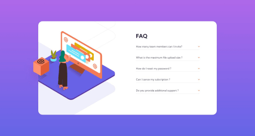
Submitted over 2 years agoA solution to the FAQ accordion card challenge
FAQ Acording Card (CSS-JS) 💚
accessibility, animation, jss, sass/scss, bem
@3eze3

Solution retrospective
Hello community, this project was complicated in the Js part because I feel that the code is not quite right, but the functionality is correct, and as for the design, if you can give me suggestions of what I can improve in my Css, I would appreciate it very much, and also my Js code, and html, I think it is correct and semantic, I did not use the details or summary tags, because I wanted a more personal design. And well as always you can tell me anything about my project and Happy coding. 🧡
Code
Loading...
Please log in to post a comment
Log in with GitHubCommunity feedback
No feedback yet. Be the first to give feedback on Deeperdev's solution.
Join our Discord community
Join thousands of Frontend Mentor community members taking the challenges, sharing resources, helping each other, and chatting about all things front-end!
Join our Discord