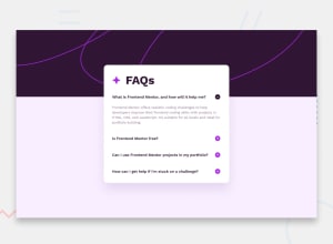
Design comparison
Solution retrospective
Hello,
I decided to go with Vite and React to create this project.
Any feedback will be appreciated, I have some doubts about the open/closed animation in the accordion.
Thanks
Community feedback
- @piushbhandariPosted 11 months ago
you should look into changing your markup to be more semantic. for example
<div class="accordion-item__title"><h3>How can I get help if I'm stuck on a challenge?</h3><img src="/assets/icon-plus.svg" alt="toggle view button"></div>can be converted to<button type="button" class="accordion-item__title"><h3>How can I get help if I'm stuck on a challenge?</h3><img src="/assets/icon-plus.svg" alt="toggle view button"></button>then adjust your styles.the reason why is because right now your component is not accessible - it's not reachable for keyboard users. add hover/focus states too
also change your max-height to be 100%. take a look what happens on mobile when there's more text than what you have currently. (it overflows)
0
Please log in to post a comment
Log in with GitHubJoin our Discord community
Join thousands of Frontend Mentor community members taking the challenges, sharing resources, helping each other, and chatting about all things front-end!
Join our Discord
