Design comparison
SolutionDesign
Solution retrospective
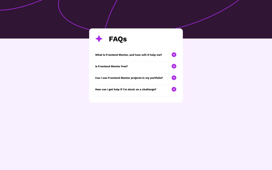
This is my solution :)
Community feedback
- @turanarican2022Posted 10 months ago
I suggest you to make it at most 90% wide on mobile. It looks too crumped
Marked as helpful0
Please log in to post a comment
Log in with GitHubJoin our Discord community
Join thousands of Frontend Mentor community members taking the challenges, sharing resources, helping each other, and chatting about all things front-end!
Join our Discord
