Design comparison
SolutionDesign
Community feedback
- @matt2282Posted 3 months ago
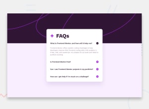
I like the animation on the buttons and the accordion functions as expected.
A few bugs and issues I encountered:
- When on mobile and you expand the accordion all the way out on all four questions the top of the page can start to get cut off.
- Your page does not have any support for keyboard only navigation.
Marked as helpful0@konradbaczykPosted 3 months ago@matt2282 Thank you for check my project. I will pay attention for this in the next projects.
0
Please log in to post a comment
Log in with GitHubJoin our Discord community
Join thousands of Frontend Mentor community members taking the challenges, sharing resources, helping each other, and chatting about all things front-end!
Join our Discord
