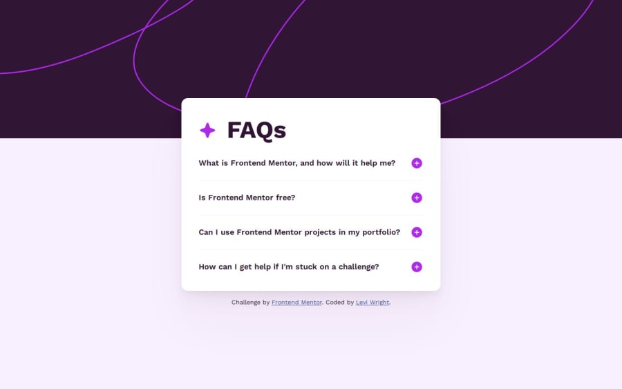
Design comparison
Solution retrospective
I like how the background image scales, and how it switches from mobile to desktop displays via media queries. While I like trying to use transitions, I think an instant change works alright here.
Next time, I would try out making the accordion using JavaScript and/or making it more accessible.
What challenges did you encounter, and how did you overcome them?On Safari, the desktop background image didn't scale properly. Using width: 100%, the image's width was fixed and did not respond to the viewport width. Using width: 100vw, the image's width was dynamic, but could not go beyond the width the viewport had whenever the page was loaded/refreshed.
To solve this problem, the div containing the background images was given a width of 100%, and the background images were set to inherit their widths:
What specific areas of your project would you like help with?.background__container { width: 100%; } .background__desktop, .background__mobile { width: inherit; }
I have a couple of questions:
- What is the best way to implement the plus and minus sign SVGs? I tried to find a way to insert them as mask images using
::afteron the summary elements, but I encountered a "CORS" error, and this method overall was unfamiliar to me. Should they have been added as images that have alt text (which is what I went with), or would the svg tag have been more appropriate? - Given the use of the details and summary tags, what are the best ways to make this solution more accessible?
Community feedback
- @grace-snowPosted 6 months ago
Those icons are decorative so must have empty alt.
Alternatively you can see how to do it with inline svgs by just changing the rect inside an svg here: https://inclusive-components.design/collapsible-sections/
The background images should also be treated as decorative.
Definitely don't hide and show img elements like this. Use the picture element for those backgrounds. Much more performant.
One more thing - lose those title attributes off the footer links. They are unnecessary, leading to duplicate screen reader announcements for some, and ignored by others.
Marked as helpful1P@law973Posted 6 months ago@grace-snow Thanks for the feedback! I made the alts empty, switched to using the picture element for the backgrounds, and removed the title attributes. Using inline svgs and changing their styling is an option I'll remember to consider for any similar cases in the future.
1
Please log in to post a comment
Log in with GitHubJoin our Discord community
Join thousands of Frontend Mentor community members taking the challenges, sharing resources, helping each other, and chatting about all things front-end!
Join our Discord
