
Design comparison

Solution retrospective
None!
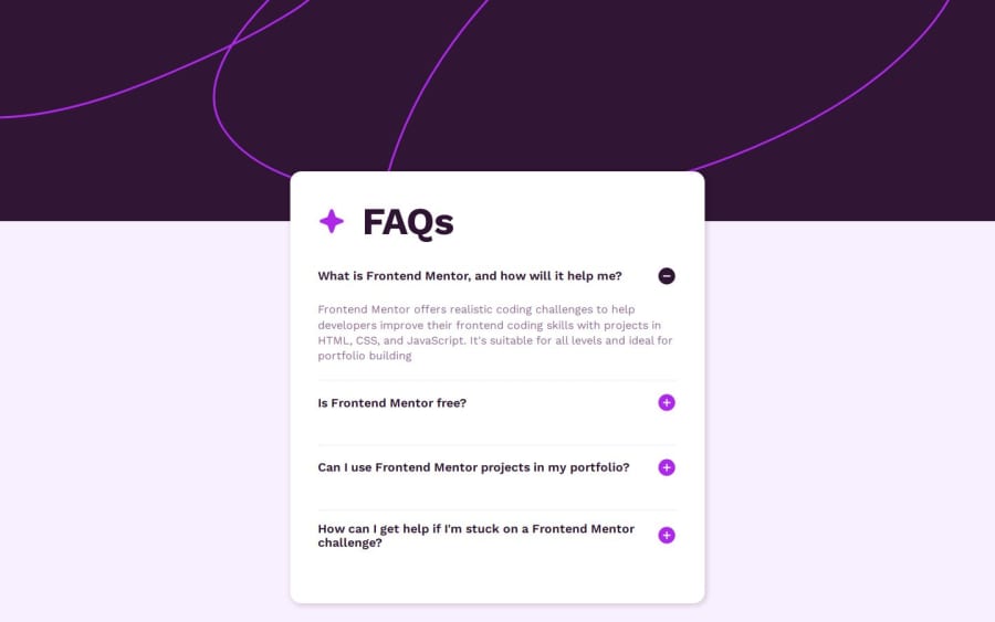
What challenges did you encounter, and how did you overcome them?Since this was my first js challenge, I struggled a lot. I thought this is the easiest js challenge per FM filter, but I don't think so, at least in my case. I wasn't able to add a smooth transition. I used display:none at first but couldn't add a transition, so I had to use the height option with the help of Google (no lie), so I managed to do it on my own. Also, I've noticed my answers expanding, but with that, my questions would push upwards, which made it look weird for some reason, so I added some margin. I still don't know if my solution is good enough. I am planning to add keyboard navigation and better height handling soon but didn't wanna get stuck so I submitted the solution.
What specific areas of your project would you like help with?Please help me, guys.
- I don't want my card to shrink or grow and would prefer it to be fixed size even if I collapse my first expanded answer, which is a default as per design.
- I need help with Accordion's most preferred approach in the sense that I don't know what the most preferred approach when it comes to accordion
- I couldn't fix my card exactly in the middle as per design so I did it ugly way by adding padding to the body
- I need a permanent fix or solution to avoid questions shifting upwards when we expand the answers. I was able to do it here using margin but I don't know if its right way to do it.
Community feedback
Please log in to post a comment
Log in with GitHubJoin our Discord community
Join thousands of Frontend Mentor community members taking the challenges, sharing resources, helping each other, and chatting about all things front-end!
Join our Discord