Design comparison
Solution retrospective
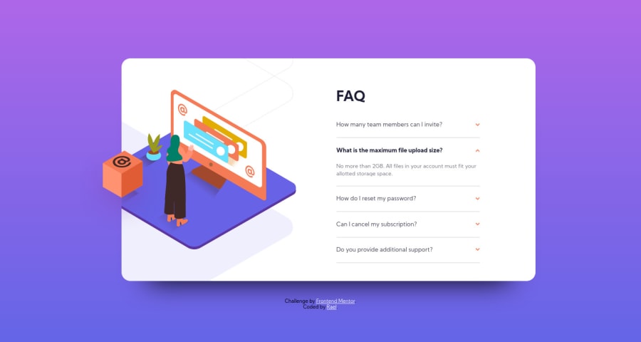
Does anyone know how to get the box-shadow right? I'm not satisfied with the solution I came up with regarding the bottom shadows and I also noticed that the cube also seems to have it's own shadow that spills into the original image. I tried quite a few things but didn't manage to get just like in the original design.
Does anyone have any ideas how to manage those?
Any advice would be much apreciated, thank you!
Community feedback
- @franco-aPosted over 3 years ago
Hey Rael, good job with the design! Unfortunately, I'm not so sure with box shadows so I can't help you there. I did notice that your code has a lot of id selectors. You should use classes instead as they are better for re usability and will give you less headaches when it comes to specificity. I recommend reading this article about it here https://dev.to/clairecodes/reasons-not-to-use-ids-in-css-4ni4 Also, you might be interested in the BEM(Block-Element-Modifier) methodology, as it's a good way to organize code a little bit better. Happy coding!
2@RaelianPosted over 3 years ago@franco-a Thanks for the advice and the article link! That helped me get more insight regarding the use of classes over ids! ^^
I'll have to look into the BEM methodology, last thing I want is code that's a pain in the ass to read heh.
Thanks again! ^^
0 - @AgataLiberskaPosted over 3 years ago
Hi Rael! I also find box shadows quite tricky to do, it's worth keeping in mind that smooth-looking box shadows are often multiple shadows overlaid on top of each other. And to get the shadow under the box, you'll probably need to give it a separate one - I found this article on using the filter property to add shadows to images.
Maybe check out this list of box shadow examples
Overall though - your solution looks and works well but is not accessible - you can't toggle the accordions with keyboard. The standard would be to use buttons and add JS but if you want to keep it CSS only, maybe try to hide the inputs in an accessible way (using
display: none
hides the element completely from assistive technologies) and add styling to the labels when the focus is on input.Hope this helps :)
1@RaelianPosted over 3 years ago@AgataLiberska Thank you for the advice, I'm gonna look into the article and examples! The shadows just kept bugging me to no end! XD This should help!
As for the solution I used, I went with the challenge of not using Javascript just to see if I could do it. Didn't cross my mind about accessibility, I guess I could maybe use "position: absolute;" with "left: -100vw;" instead of "display:none;". This way it should be off screen but still accesible I think? Will have to try it. Thanks for the advice! ^^
EDITED:
Just wanted to say that the idea with the position left -100vw worked! Now I can use the keyboard to access those inputs and the labels get the orange color when focused on! Just need to re-upload it!
0@AgataLiberskaPosted over 3 years ago@Raelian Check out this article about accessible hiding I think it will be helpful!
1@RaelianPosted over 3 years ago@AgataLiberska Thanks, it helped give me a few new ideas and now it works! ^^
0
Please log in to post a comment
Log in with GitHubJoin our Discord community
Join thousands of Frontend Mentor community members taking the challenges, sharing resources, helping each other, and chatting about all things front-end!
Join our Discord