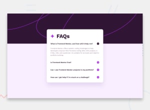
Design comparison
Solution retrospective
Overall fun challenge.
Some noteable portions
- Decided to use CSS background property for the backdrop pattern rather than having it as a component in the flow of the HTML document as it was purely for decorative purposes.
- Tried to abstract the accordion into a more generic component that could be reused depending on the title and data provided. Enforced via TypeScript.
- Loaded fonts locally rather over Google Font's API to learn how to do so.
- Using SVGR library to make the button SVGs components rather than as images.
Requesting feedback on:
- Typings of the various components and interfaces
- Possible improvements to make the components more reusable
- Project structure
- Anything :)
Community feedback
- @HunterPfannenstielPosted 10 months ago
Overall, your project looks great! I have two recommendations but these are by no means necessary and what you are doing works just fine.
The first recommendation is to put the props for a component directly in the component file (I define them right before the component declaration). This makes it very easy, especially when viewing code on GitHub, to know what the component expects for props without having to navigate to a different file.
The second recommendation is for your accordion item component. I would move the toggling logic (although very minimal) into a hook, maybe called "useToggle", and just expose the "isOpen" state and a toggle function that simply switches the state to the opposite state.
Good work!
0
Please log in to post a comment
Log in with GitHubJoin our Discord community
Join thousands of Frontend Mentor community members taking the challenges, sharing resources, helping each other, and chatting about all things front-end!
Join our Discord
