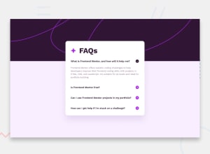
Design comparison
Solution retrospective
I´m pretty proud of my solution outcome in general. This time i could take the time to be attending to detail, specially on visual aspects.
What challenges did you encounter, and how did you overcome them?The biggest challenge this afternoon and the day after was to decide the architecture of the whole solution, to give the right output.
Community feedback
- @edwinc73Posted 4 months ago
Congratulations on completing the challenge. Looks like you are using react however you are using it like regular javascript. You could try to use the useState hook to control whether each question is opened or not.
The html contains buttons which is what I would also use for this solution as it is operabke by keyboard.
In terms of accessibilty you are missing a title element in your html and some meta tags. I noticed that when the screen is small the faq is pinned to the top. I think this is because you are using a negative margin top and a bg image with variable height. At some point the img gets so short that the faq is pinned to the top. You could instead try using
position: absoluteGreat attempt!
Marked as helpful0
Please log in to post a comment
Log in with GitHubJoin our Discord community
Join thousands of Frontend Mentor community members taking the challenges, sharing resources, helping each other, and chatting about all things front-end!
Join our Discord
