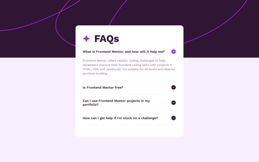
Design comparison
Solution retrospective
I recently completed fac accordion challenge, and I'm reaching out to the community for feedback. Your expertise and insights would be invaluable in helping me improve and refine my work.
- Any suggestions on improving the overall design and user experience?
- Are there areas of my code that could be optimized or written more efficiently?
- How well does the project perform on different devices and screen sizes?
I'm open to any constructive criticism and appreciate your time and expertise. Thank you in advance for taking the time to review my project.
Community feedback
- @grace-snowPosted 9 months ago
Hi
I'm afraid this is inaccessible at the moment so needs some changes.
The whole question must be clickable so that must be inside the button too.
For disclosures you must use an accessible pattern with
- an aria-expanded button
- an accessibile name on that button (in this case the question
- a unique ID on the answer (preferable)
- aria-controls on the button pointing to that unique answer ID (preferable)
I wrote up a disclosure tutorial
You also should be working mobile first.
And media queries must be defined in rem or em not px. (There's a post about media queries on the site above too)
And don't forget html basics like ensuring all content is contained within landmarks!
Marked as helpful1@grace-snowPosted 9 months agoOne more thing. I recommend you read this post on common beginner mistakes in react as I notice you're using the index as a key for the loop over faqs. This explains the danger of that habit.
1@CreixzPosted 9 months ago@grace-snow
I want to thank you very much for the time you take to review my code and in respect to that time you take, I made a new project that I hope this time will be much better and accessible. Thanks for your help, I want to be an excellent frontend developer.
0@grace-snowPosted 8 months ago@Creixz you don't need to create a new project. Keep the repo you've got and work on that. The beauty of git version control is being able to keep that history and make incremental improvements.
0 - @KorneyChervonenkoPosted 9 months ago
Hello, friend I think you have mixed up with plus\minus icons
1
Please log in to post a comment
Log in with GitHubJoin our Discord community
Join thousands of Frontend Mentor community members taking the challenges, sharing resources, helping each other, and chatting about all things front-end!
Join our Discord
